Modifying blocks types and custom blocks
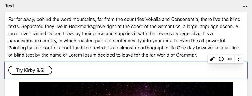
Kirby's blocks field comes with a basic set of block types that covers most needs for long form content.
However, you might want to extend our custom block types, particularly how they are rendered in the frontend, or you might want to turn the blocks field into a page builder. That is where custom blocks come into play.
This recipe covers the basics and provides links to more extensive documentation.
Custom block types
You can create your own Block types for the Blocks field. Custom blocks are defined directly in the fieldsets list:
fields:
  blocks:
    type: blocks
    fieldsets:
      - heading
      - text
      button:
        name: Button
        icon: bolt
        fields:
          link:
            type: url
          text:
            type: text
In the example above, we mix the default block types (heading and text) with our own custom block type to add a call to action button.
Preview
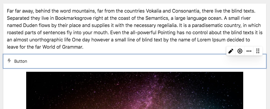
Custom block types don't have a visual preview by default. They show up with the icon and the name from your blueprint definition.
Label
Custom block types can use the label property to show some information from a field in the block. This can be particularly useful for blocks that don't have a preview:
fields:
  blocks:
    type: blocks
    fieldsets:
      - heading
      - text
      button:
        name: Button
        icon: bolt
        label: "{{ text }}"
        fields:
          link:
            type: url
          text:
            type: text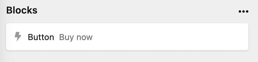
Within the label property, you have access to an array of field properties, here are some more examples:
label: "{{ structure.length }}" # to get the number of items in a structure field

label: "{{ gallery.length }} images" # to get the number of images in a gallery files field

label: "{{ image.0.filename }}" # to get the filename of the first image in the image files field
Editing
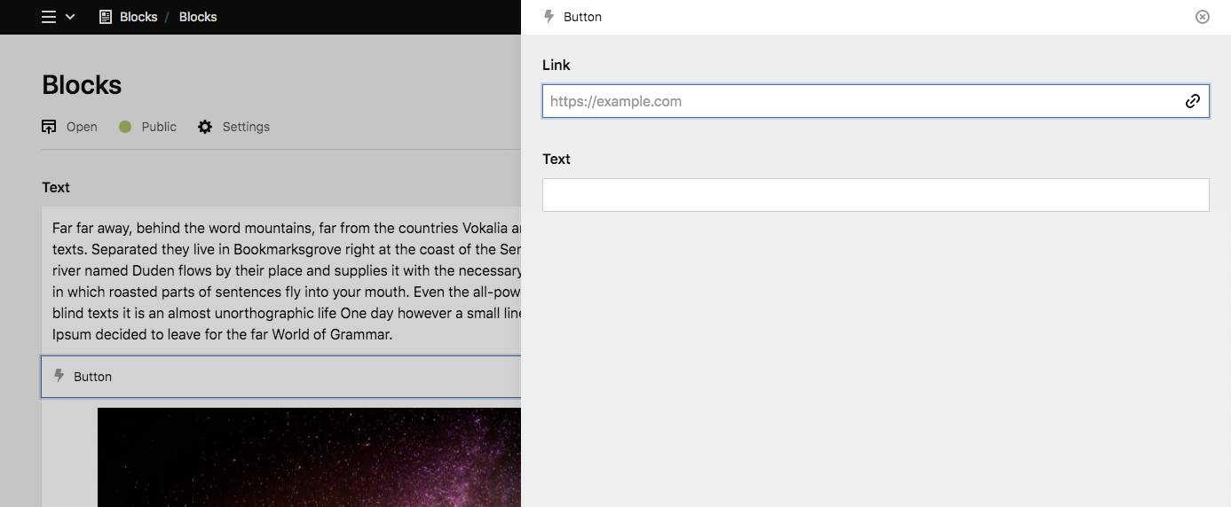
To edit a custom block type, editors can either double-tap on the block or click on the edit icon in the toolbar. The block drawer opens with the fields you've defined for the block.
Drawer-less blocks
If you don't define any fields, the block won't have a drawer. This can be useful for blocks that don't feature any configuration (e.g. the default line block).
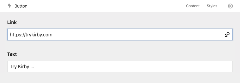
Tabs
You can also define tabs for your blocks when they have a lot of settings:
fields:
  blocks:
    label: Text
    type: blocks
    fieldsets:
      - heading
      - text
      button:
        name: Button
        icon: bolt
        tabs:
          content:
            fields:
              link:
                type: url
              text:
                type: text
          styles:
            fields:
              class:
                type: text
              id:
                type: text
The tabs will then show up in the block drawer.
Global block types
For reuse in multiple places, custom block type definitions can be stored in a folder called site/blueprints/blocks. In this case we would store it in /site/blueprints/blocks/button.yml:
# /site/blueprints/blocks/button.yml
name: Button
icon: bolt
tabs:
  content:
    fields:
      link:
        type: url
      text:
        type: text
  styles:
    fields:
      class:
        type: text
      id:
        type: text
Now, we can use it in our fieldsets option for any blocks field.
fields:
  blocks:
    type: blocks
    fieldsets:
      - heading
      - text
      - button
This also works in groups:
fields:
  text:
    type: blocks
    fieldsets:
      text:
        label: Text
        type: group
        fieldsets:
          - heading
          - text
          - list
          - button
      media:
        label: Media
        type: group
        fieldsets:
          - image
          - video
      code:
        label: Code
        type: group
        fieldsets:
          - code
          - markdown
Custom block type snippet
To render the HTML for your custom block type in the frontend, create a snippet in /site/snippets/blocks. In this case we create a file called /site/snippets/blocks/button.php
<a href="<?= $block->link() ?>" class="btn">
  <?= $block->text() ?>
</a>
Preview plugins
You can turn your custom blocks into highly visual, interactive representations with a custom block preview plugin.
Read our plugin guide on how to create such previews.
Extending core blocks
You can take our core blocks as a starting point for your own custom blocks and extend them with your own fields, snippets and previews. Extending our core blocks works the same way as extending fields, tabs or sections in blueprints everywhere else.
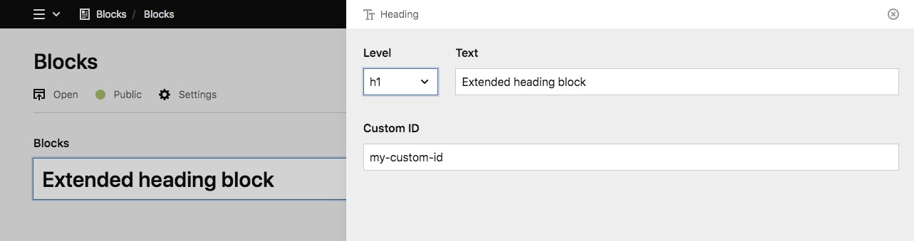
Example: extending the heading block
Let's take the heading block and add a simple text field to add a custom ID for the heading
fields:
  blocks:
    type: blocks
    fieldsets:
      heading:
        extends: blocks/heading
        fields:
          customId:
            label: Custom ID
            type: text
This will add the customID field below the default fields of the block.
Extending existing fields
Instead of only adding new fields, you can also adjust the field settings for the default fields of the block.
Let's limit the number of heading levels for our heading block.
fields:
  blocks:
    type: blocks
    fieldsets:
      heading:
        extends: blocks/heading
        fields:
          level:
            options:
              - h2
              - h3
You can find all block fields and their settings in the docs for each block.
Adding tabs
You can extend our core blocks with additional tabs. Be aware though that you need to recreate all default fields in this case, as tabs will replace the default fields.
fields:
  blocks:
    type: blocks
    fieldsets:
      heading:
        extends: blocks/heading
        tabs:
          content:
            fields:
              level:
                type: select
                empty: false
                default: "h2"
                width: 1/6
                options:
                  - h1
                  - h2
                  - h3
              text:
                type: writer
                inline: true
                width: 5/6
              customId:
                label: Custom ID
                type: text
          styles:
            fields:
              backgroundColor:
                type: select
                options:
                  - red
                  - green
                  - blue
              textColor:
                type: select
                options:
                  - white
                  - black
Block snippets
The HTML for each individual block is stored in its own block snippet. All our default block types bring their own snippets and can be overwritten. Block snippets are stored in /site/snippets/blocks
As an example, if you want to overwrite the snippet for our heading block, you would create a snippet file called /site/snippets/blocks/heading.php
The default heading snippet
<<?= $level = $block->level()->or('h2') ?>>
  <?= $block->text() ?>
</<?= $level ?>>
Your customized version
<<?= $level = $block->level()->or('h2') ?> id="<?= $block->customId()->or($block->id()) ?>">
  <?= $block->text() ?>
</<?= $level ?>>