Advanced Panel area
Intro
Among other use cases, Panel areas are a great way to show and edit data that is not bound to Kirby pages, real or virtual, for example a product list from a JSON file or database.
This recipe is based on the products area demo Bastian presented during the 3.6 product launch, but we will extend it a bit.
For the purposes of this recipe, we assume you have read the Panel plugin setup guide on how to get started with our Panel plugin bundler kirbyup and are familiar with the basic Panel area setup.
You can install the Pluginkit as a basis or create the file structure we need manually, that’s up to you. Also, it doesn’t matter if you use the Plainkit or the Starterkit as a starting point.
Downloads
You can either download the demo with the products example or ideally code along as we go through the steps in this recipe.
Let’s start by creating a new products folder inside the plugins folder. Inside the products folder, we first create a package.json file with the contents copied from the Pluginkit example mentioned above.
{
  "scripts": {
    "dev": "npx -y kirbyup src/index.js --watch",
    "build": "npx -y kirbyup src/index.js"
  }
}
This will take care of compiling our source files into an index.js file in the root of our products plugin folder.
index.php
The most important stuff for our shiny new area happens in the PHP part of the plugin. Inside the products folder, we create the obligatory index.php with the Kirby plugin wrapper. And inside this wrapper, we define the new area:
<?php

function products() {
    return Data::read(__DIR__ . '/products.json');
}

Kirby::plugin('getkirby/products', [
  'areas' => [
    'products' => [
      'label'   => 'Products',
      'icon'    => 'cart',
      'menu'    => true,
      // update and delete dialogs
      'dialogs' => [
          require __DIR__ . '/dialogs/update.php',
          require __DIR__ . '/dialogs/delete.php'
      ],
      // dropdown with edit and delete buttons
      'dropdowns' => [
          //require __DIR__ . '/dropdowns/product.php'
      ],
      // search for productss
      'searches' => [
          //'products' => require __DIR__ . '/searches/products.php'
      ],
      // view route
      'views' => [
        require __DIR__ . '/views/products.php'
      ]
    ]
  ]
]);
For the moment, let's comment dropdowns and searches, we will get to that later.
This code snippet looks very clean, because the separate parts are moved into their own files, which we will go through step by step.
Plugin structure
Before we continue, let's create the missing files and folders for the basic plugin structure as outlined in the index.php file, which looks like this:
products
dialogs
- delete.php
- update.php
dropdowns
- product.php
searches
- products.php
src
components
- Products.Vue
- index.js
views
- products.php
- index.php
- package.json
- products.json
products.json
The products.json file contains the product data for this example, you can copy it into the plugins folder from the demo files. It has the following basic structure (leaving out the fields that are not used in our example):
{
  "bd5nKG": {
    "description": "Sweet fresh strawberry on the wooden table",
    "id": "bd5nKG",
    "price": 29.45,
    "title": "Sweet fresh strawberry",
    "type": "fruit"
  },
  "Icljfk": {
    "description": "Asparagus with ham on the wooden table",
    "id": "Icljfk",
    "price": 18.95,
    "title": "Asparagus",
    "type": "vegetable"
  },
  // ...
}
View route
If we opened the Panel at this point, we wouldn't see much apart from the menu entry. So let's add the PHP part for the view first.
<?php

return [
    'pattern' => 'products',
    'action'  => function () {
        return [
            'component' => 'k-products-view',
            'props' => [
                'products' => products()
            ]
        ];
    }
];
A view is a route with a pattern that when called executes the given action, that has to return an array. This array controls the Vue component to be loaded, the props for the component and (optional) other settings for the view.
The Vue component we will create in a second, we call k-products-view, and as props we return the product list from the JSON file as array via the products function we defined at the top of our index.php.
The props we return to the component can of course be anything, so the product data from the JSON file can easily be replaced with data from a database or an API (see example in the My first Panel area recipe).
We could for example pass the user role to the component and show different stuff based on role, or a config option for the layout etc.. The possibilities here are rather endless.
View component
Let's move on to the JS side of stuff. In our index.js we register the k-products-view component:
import Products from "./components/Products.vue";

panel.plugin("getkirby/products", {
  components: {
    "k-products-view": Products
  }
});
The view component itself lives in the imported Products.vue file and is responsible for actually displaying the data we passed to it as props in the view's route.
The product data itself we display in a table.
<template>
  <k-inside>
    <k-view>
      <k-header>Products</k-header>
      <table class="k-products">
        <tr>
          <th>Title</th>
          <th class="k-product-type">Type</th>
          <th>Description</th>
          <th class="k-product-price">Price</th>
          <th class="k-product-options"></th>
        </tr>
        <tr v-for="(product, id) in products" :key="id">
          <td>{{ product.title }}</td>
          <td class="k-product-type">{{ product.type }}</td>
          <td>{{ product.description }}</td>
          <td class="k-product-price">{{ price(product.price) }}</td>
          <td class="k-product-options">
            <k-options-dropdown :options="'products/' + id" />
          </td>
        </tr>
      </table>
    </k-view>
  </k-inside>
</template>

<script>
export default {
  props: {
    products: Object
  },
  methods: {
    // format the price in EURO
    price(price) {
      return new Intl.NumberFormat('de-DE', { style: 'currency', currency: 'EUR' }).format(price);
    }
  }
};
</script>

<style>
.k-products {
  width: 100%;
  table-layout: fixed;
  border-spacing: 1px;
}
.k-products td,
.k-products th {
  text-align: left;
  font-size: var(--text-sm);
  padding: var(--spacing-2);
  white-space: nowrap;
  text-overflow: ellipsis;
  overflow: hidden;
  background: var(--color-white);
}
.k-product-type {
  width: 8rem;
}
.k-product-price {
  width: 5rem;
  font-variant-numeric: tabular-nums;
  text-align: right !important;
}
.k-product-options {
  padding: 0 !important;
  width: 3rem;
  overflow: visible !important;
}
</style>
Maybe worth mentioning is the price method which converts the price into a nicely formatted currency.
The last table column contains the options dropdown for the edit and delete buttons).
<k-options-dropdown :options="'products/' + id" />Compile and check
At this point, it's time to build the index.js file. To this purpose we open a terminal, cd into the products folder and run
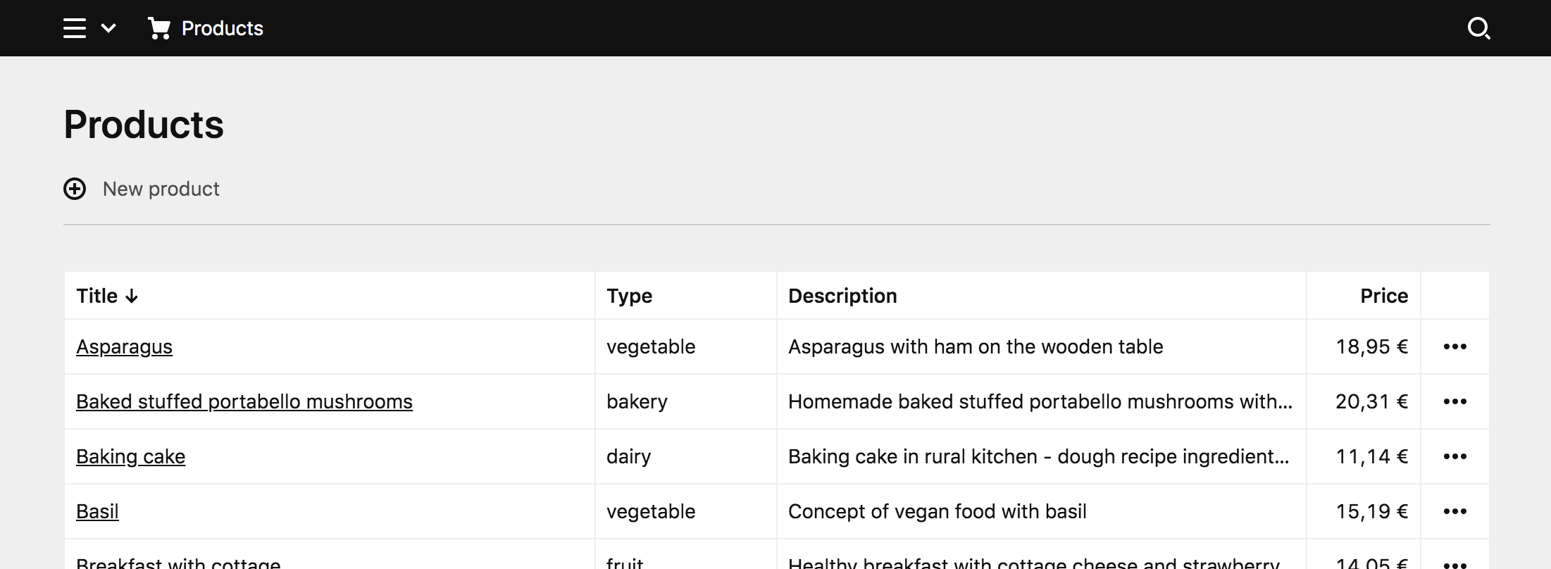
npm run devNow open the Panel and navigate to the new Panel area. It will now look like this:
Since we haven't implemented the dropdowns yet, they will throw an error if you click on the buttons. But we already have a nice working list view of our products!
Options dropdown
The options dropdown is again a route that returns an array of options with text, icon and the dialog to open when clicked. Here the options are update and delete.
<?php

return [
    'pattern' => 'products/(:any)',
    'action'  => function (string $id) {
        return [
            [
                'text'   => 'Edit',
                'icon'   => 'edit',
                'dialog' => 'products/' . $id . '/update'
            ],
            [
                'text'   => 'Delete',
                'icon'   => 'trash',
                'dialog' => 'products/' . $id . '/delete'
            ]
        ];
    }
];
Dialogs
What is still missing is the dialogs. Dialogs are a part of Panel area extensions, and each dialog has a route pattern at which the dialog is called.
Each dialog has a load callback and a submit callback. You can read more about those callbacks in the docs linked above.
Delete
The delete dialog reuses Kirby's k-remove-dialog component, asks for confirmation, and on submit removes the product with the given id from the array and writes the remaining new array to file.
<?php

return [
    'pattern' => 'products/(:any)/delete',
    'load' => function (string $id) {
        return [
            'component' => 'k-remove-dialog',
            'props' => [
                'text' => 'Do you really want to delete this product?'
            ]
        ];
    },
    'submit' => function (string $id) {
        $products = products();

        unset($products[$id]);

        Data::write(__DIR__ . '/../products.json', $products);

        return true;
    }
];
Update
The update dialog uses Kirby's k-form-dialog component, in which we define the fields the user can edit. Each field is an array with the same props you would usually define in the blueprint for the given field type. Here we use two text fields for title and type, a textarea field for the description and a number field for the price. As value we set the current product.
<?php

return [
    'pattern' => 'products/(:any)/update',
    'load'    => function (string $id) {
        $product = products()[$id];

        return [
            'component' => 'k-form-dialog',
            'props' => [
                'fields' => [
                    'title' => [
                        'label' => 'Title',
                        'type'  => 'text'
                    ],
                    'type' => [
                        'label' => 'Type',
                        'type'  => 'text'
                    ],
                    'description' => [
                        'label'   => 'Description',
                        'type'    => 'textarea',
                        'buttons' => false
                    ],
                    'price' => [
                        'label'  => 'Price',
                        'type'   => 'number',
                        'step'   => 0.01,
                        'before' => '€'
                    ]
                ],
                'value' => $product
            ]
        ];
    },
    'submit' => function (string $id) {
        $products = products();
        $products[$id] = get();

        Data::write(__DIR__ . '/../products.json', $products);

        return true;
    }
];
Once the user submits the dialog, we overwrite the existing array item with the new data and write the new data to file.
At this point, uncomment the commented lines in your index.php.
And with these dialogs in place, we can now update items or delete them from the list.
This is where the demo from the video ends. It’s all still a bit rough around the edges. Let’s extend it some more!
Clean up
There are a few questionable choices in the demo that are only there for practical reasons to shorten the demo for the video.
A little bit of OOP
We still have the products() helper function in our index.php and some rough ways to read, update and delete from the products.json file. To clean this up, we will create a new Product model class in PHP, which will be responsible for basic CRUD tasks (create, update, delete).
Such a model class will help us to write and organize all the code that it needs to work with products and validate user input.
If you are not familiar with object oriented programming in PHP yet, you should follow Sonja's excellent introduction.
The example class is pretty long, but fully documented. You can either read through the code and comments or copy and paste it into your version and keep scrolling.
<?php

namespace Kirby\Products;

use Kirby\Data\Data;
use Kirby\Exception\InvalidArgumentException;
use Kirby\Exception\NotFoundException;
use Kirby\Toolkit\V;

class Product
{

    /**
     * Creates a new product with the given $input
     * data and adds it to the json file
     *
     * @return bool
     */
    public static function create(array $input): bool
    {
        // reuse the update method to create a new
        // product with the new unique id. If you need different logic
        // here, you can easily extend it
        return static::update(uuid(), $input);
    }

    /**
     * Deletes a product by product id
     *
     * @return bool
     */
    public static function delete(string $id): bool
    {
        // get all products
        $products = static::list();

        // remove the product from the list
        unset($products[$id]);

        // write the update list to the file
        return Data::write(static::file(), $products);
    }

    /**
     * Returns the absolute path to the products.json
     * This is the place to modify if you don't want to
     * store the products in your plugin folder
     * – which you probably really don't want to do.
     *
     * @return string
     */
    public static function file(): string
    {
        return __DIR__ . '/../products.json';
    }

    /**
     * Finds a product by id and throws an exception
     * if the product cannot be found
     *
     * @param string $id
     * @return array
     */
    public static function find(string $id): array
    {
        $product = static::list()[$id] ?? null;

        if (empty($product) === true) {
            throw new NotFoundException('The product could not be found');
        }

        return $product;
    }

    /**
     * Lists all products from the products.json
     *
     * @return array
     */
    public static function list(): array
    {
        return Data::read(static::file());
    }

    /**
     * Lists all available product types
     *
     * @return array
     */
    public static function types(): array
    {
        return [
            'bakery',
            'dairy',
            'fruit',
            'meat',
            'vegan',
            'vegetable',
        ];
    }

    /**
     * Updates a product by id with the given input
     * It throws an exception in case of validation issues
     *
     * @param string $id
     * @param array $input
     * @return boolean
     */
    public static function update(string $id, array $input): bool
    {
        $product = [
            'id'          => $id,
            'title'       => $input['title'] ?? null,
            'type'        => $input['type'] ?? null,
            'description' => $input['description'] ?? null,
            'price'       => floatval($input['price'] ?? null)
        ];

        // require a title
        if (V::minlength($product['title'], 1) === false) {
            throw new InvalidArgumentException('The title must not be empty');
        }

        // make sure the title is not longer than expected
        if (V::maxlength($product['title'], 100) === false) {
            throw new InvalidArgumentException('The title must not be longer than 100 characters');
        }

        // validate the product category
        if (V::in($product['type'], static::types()) === false) {
            throw new InvalidArgumentException('Please select a valid product category');
        }

        // validate the price
        if (V::min($product['price'], 0.01) === false) {
            throw new InvalidArgumentException('The product must not be free');
        }

        // load all products
        $products = static::list();

        // set/overwrite the product data
        $products[$id] = $product;

        return Data::write(static::file(), $products);
    }

}
Loading PHP classes
We somehow need to include our new Product class in our plugin. We can do this with a simple require, by using Composer or with Kirby’s load() method.
If you need to load just a couple of classes, Kirby’s load() method is perfectly fine. For more complex plugins you might want to checkout autoloading with Composer instead.
The load() method should be placed right at the top of your index.php. All classes that should be autoloaded are added with their full name followed by the absolute path to the PHP file.
Why load() instead of require? When you require the class file in your index.php it will be loaded as soon as the plugin is registered. By using the load() method, the class is only autoloaded when needed.
<?php

load([
  'Kirby\Products\Product' => __DIR__ . '/classes/Product.php'
]);

Kirby::plugin('getkirby/products', [
  'areas' => [
    'products' => [
      'label'   => 'Products',
      'icon'    => 'cart',
      'menu'    => true,
      // update and delete dialogs
      'dialogs' => [
          require __DIR__ . '/dialogs/update.php',
          require __DIR__ . '/dialogs/delete.php'
      ],
      // dropdown with edit and delete buttons
      'dropdowns' => [
          require __DIR__ . '/dropdowns/product.php'
      ],
      // search for productss
      'searches' => [
          //'products' => require __DIR__ . '/searches/products.php'
      ],
      // view route
      'views' => [
          require __DIR__ . '/views/products.php'
      ]
    ]
  ]
]);
Our shiny new class can now be used in our existing view and dialogs.
The products view uses the new Product::list() method to get an array of all products.
<?php

use Kirby\Products\Product;

return [
    'pattern' => 'products',
    'action'  => function () {
        return [
            'component' => 'k-products-view',
            'props' => [
                'products' => Product::list()
            ]
        ];
    }
];
The update dialog gets a couple cool updates. Product::find() will not just load the right entry, it will also throw an exception if it cannot be found. This will automatically be handled by the Panel and the user gets a proper warning.
The same happens when the Product::update() method in the submit handler detects a validation issue or has any other issues. This increases the UX of the dialog quite a bit.
We’ve also converted the type field to a select box and used the Product::types() method to create the options. This is great because we can now update our available types in one place, which will update the field and the backend validation at the same time.
<?php

use Kirby\Products\Product;

return [
    'pattern' => 'products/(:any)/update',
    'load'    => function (string $id) {
        $product = Product::find($id);

        return [
            'component' => 'k-form-dialog',
            'props' => [
                'fields' => [
                    'title' => [
                        'label' => 'Title',
                        'type' => 'text'
                    ],
                    'type' => [
                        'label' => 'Type',
                        'type' => 'select',
                        'empty' => false,
                        'width' => '1/2',
                        'options' => A::map(Product::types(), function ($type) {
                            return ['value' => $type, 'text' => $type];
                        })
                    ],
                    'price' => [
                        'label' => 'Price',
                        'type' => 'number',
                        'step' => 0.01,
                        'before' => '€',
                        'width' => '1/2'
                    ],
                    'description' => [
                        'label' => 'Description',
                        'type' => 'textarea',
                        'buttons' => false
                    ]
                ],
                'value'  => $product
            ]
        ];
    },
    'submit' => function (string $id) {
        return Product::update($id, get());
    }
];
The delete dialog uses the new Product::delete() method. If you want to customize the text for each product, you could also reuse the Product::find() method in the load handler to load the product and add the title to the text for example.
<?php

use Kirby\Products\Product;

return [
    'pattern' => 'products/(:any)/delete',
    'load' => function () {
        return [
            'component' => 'k-remove-dialog',
            'props' => [
                'text' => 'Do you really want to delete the product?'
            ]
        ];
    },
    'submit' => function (string $id) {
        return Product::delete($id);
    }
];
With the cleaned up PHP code we can now extend our little plugin some more …
Adding items
Wouldn't it be great to be able to add new items, too? I think so, so let's do that. Luckily, we don't have to add a lot of code to achieve that.
Let's first add an add button to our view in the k-header component. The k-header component has two slots: left and right. The left slot is normally used to create action buttons, while the right slot is used for our navigation arrows or for the filter dropdown in the users view.
<template>
<k-inside>
<k-view>
<k-header>
Products
<k-button-group slot="left">
<k-button
text="New product"
icon="add"
@click="$dialog('products/create')"
/>
</k-button-group>
</k-header>
<table class="k-products">
<tr>
<th>Title</th>
<th class="k-product-type">Type</th>
<th>Description</th>
<th class="k-product-price">Price</th>
<th class="k-product-options"></th>
</tr>
<tr v-for="(product, id) in products" :key="id">
<td>{{ product.title }}</td>
<td class="k-product-type">{{ product.type }}</td>
<td>{{ product.description }}</td>
<td class="k-product-price">{{ price(product.price) }}</td>
<td class="k-product-options">
<k-options-dropdown :options="'products/' + id" />
</td>
</tr>
</table>
</k-view>
</k-inside>
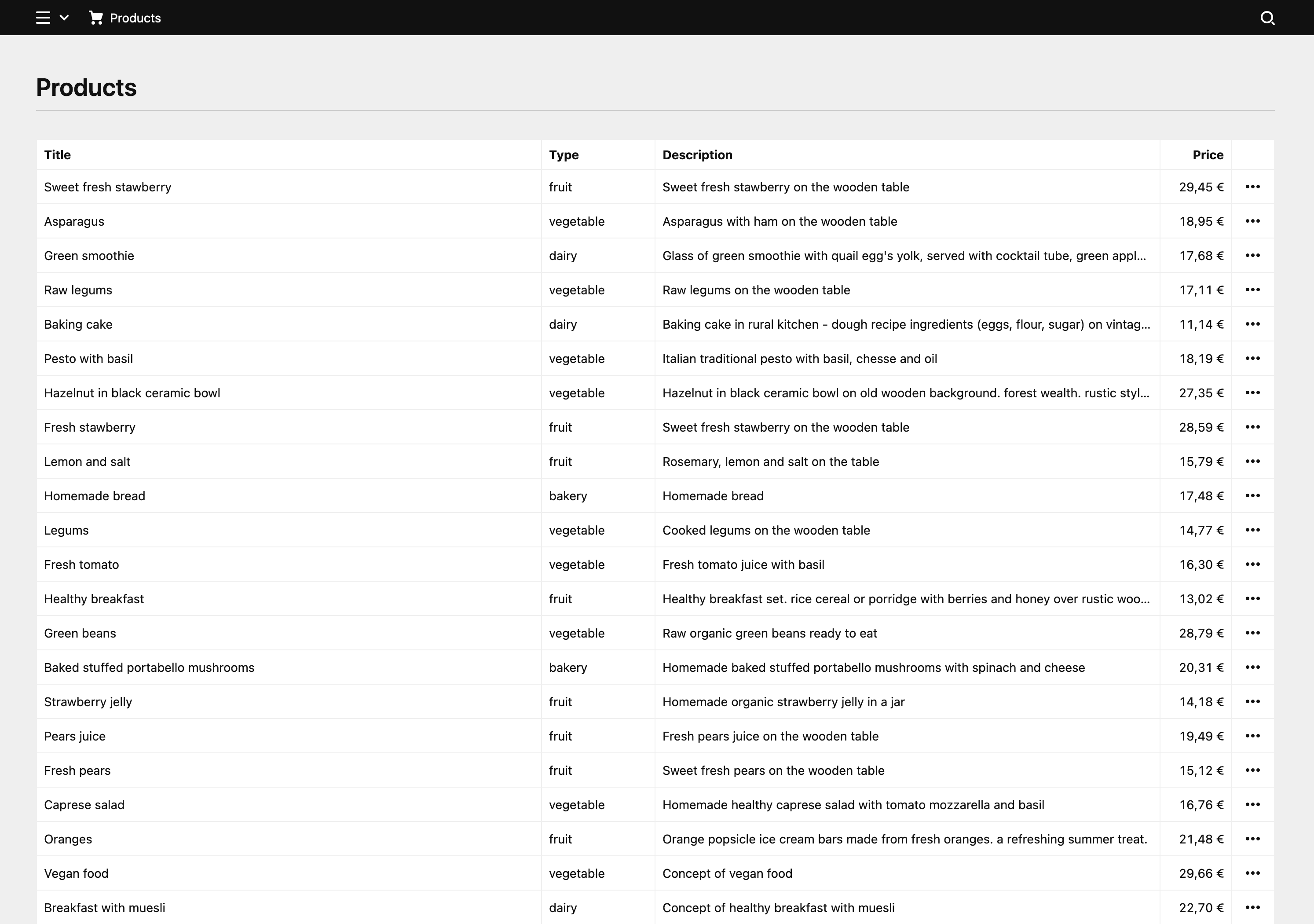
</template>The view should now look like this:
When the user clicks on this button, a new dialog, which we have yet to define, will open.
We register this new dialog in index.php next to the existing update and delete dialogs…
// …
'dialogs' => [
    require __DIR__ . '/dialogs/create.php'
    require __DIR__ . '/dialogs/update.php',
    require __DIR__ . '/dialogs/delete.php',
],
// …
and then create an create.php file in the /dialogs folder with the following code:
<?php

use Kirby\Products\Product;

return [
    'pattern' => 'products/create',
    'load'    => function () {

        return [
            'component' => 'k-form-dialog',
            'props' => [
                'fields' => [
                    ...
                ],
                'submitButton' => t('create'),
            ]
        ];
    },
    'submit' => function () {
        return Product::create(get());
    }
];
This looks pretty similar to the update dialog with a few differences:
- Because we don't update an existing product, we don't pass an id in the route pattern
- We don't pass an existing product as value.
- In the
submitaction, we useProduct::create()instead of update - We use the
submitButtonproperty to change the text of the submit button. Thet()method is used to get the correct translation forcreate. This is already available in our translations.
I've intentionally left out the fields definition in this example. We need the same fields as in the update dialog. Instead of repeating ourselves, we can put the fields into their own file instead and use them in both places.
Create a new fields.php file and move the fields definition there.
<?php

use Kirby\Products\Product;
use Kirby\Toolkit\A;

return [
    'title' => [
        'label' => 'Title',
        'type' => 'text'
    ],
    'type' => [
        'label' => 'Type',
        'type' => 'select',
        'empty' => false,
        'width' => '1/2',
        'options' => A::map(Product::types(), function ($type) {
            return ['value' => $type, 'text' => $type];
        })
    ],
    'price' => [
        'label' => 'Price',
        'type' => 'number',
        'step' => 0.01,
        'before' => '€',
        'width' => '1/2'
    ],
    'description' => [
        'label' => 'Description',
        'type' => 'textarea',
        'buttons' => false
    ]
];
You can see that it is exactly the same as before in our update dialog. The two dialogs (create and update) can now both load those fields.
<?php

use Kirby\Products\Product;

return [
    'pattern' => 'products/(:any)/update',
    'load'    => function (string $id) {
        $product = Product::find($id);

        return [
            'component' => 'k-form-dialog',
            'props' => [
                'fields' => require __DIR__ . '/fields.php',
                'value'  => $product
            ]
        ];
    },
    'submit' => function (string $id) {
        return Product::update($id, get());
    }
];<?php
use Kirby\Products\Product;
return [
'pattern' => 'products/create',
'load' => function () {
return [
'component' => 'k-form-dialog',
'props' => [
'fields' => require __DIR__ . '/fields.php',
'submitButton' => t('create'),
],
];
},
'submit' => function () {
return Product::create(get());
}
];And that's it! We can now also add products to the list. Try it out!
Search
Panel areas also allow you to add your own search type to the Panel - next to pages, files and users. With this step, we add a custom search that allows us to search through our list of products:
<?php

use Kirby\Products\Product;

return [
    'label' => 'Products',
    'icon'  => 'cart',
    'query' => function (string $query) {
        $products = Product::list();
        $results  = [];
        foreach ($products as $product) {
            if (Str::contains($product['title'], $query, true) === true) {
                $results[] = [
                    'text' => $product['title'],
                    'link' => '/products',
                    'image' => [
                        'icon' => 'cart',
                        'back' => 'purple-400'
                    ]
                ];
            }
        }

        return $results;
    }
];
In the query callback, we loop through the list items and return each item that contains the given query string in the product title. The parameters you can return for each item you find in the linked docs.
At this point, when we use the search, it works fine and returns the expected result set as we type.
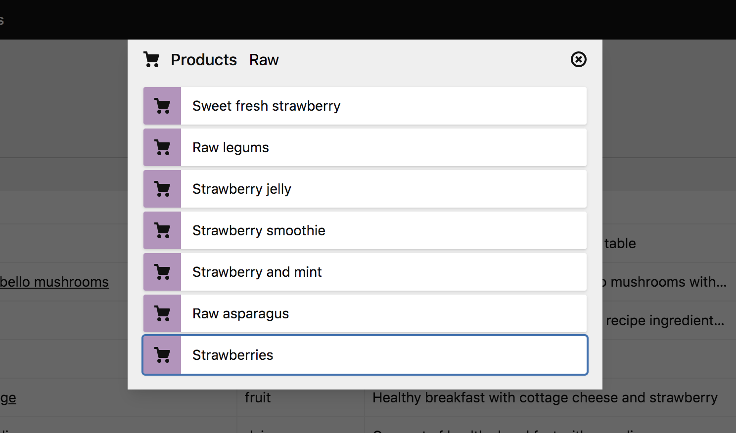
However, when we click on the desired item, we are just redirected to the current view. Also, we currently have to select the product search from the menu first.
Let's first fix the second issue by setting the products search as our default search for this view. We do that in the action callback of our product view route:
<?php

use Kirby\Products\Product;

return [
    'pattern' => 'products',
    'action'  => function () {
        return [
            'component' => 'k-products-view',
            'props' => [
                'products' => Product::list()
            ],
            // set products search as default
            'search' => 'products'
        ];
    }
];
Now, we don't have to select the right search component anymore when we use the search function. If you want to set the search as default for every view of the area, you can set the search option in the area definition.
For the second issue, we will create a single product view we can redirect to when the user clicks on an item.
Single product subview
Let's first pass the id to the link prop in the $results array:
// …
foreach ($products as $product) {
    if (Str::contains($product['title'], $query, true) === true) {
        $results[] = [
            'text' => $product['title'],
            'link' => '/products/' . $product['id'],
            'image' => [
                'icon' => 'cart',
                'back' => 'purple-400'
            ]
        ];
    }
}
// …
Next, we need a second route for our area, which we register next to the first one in the index.php file:
// …
'views' => [
  require __DIR__ . '/views/products.php',
  require __DIR__ . '/views/product.php'
]
// …
We then create the the new product.php file in the /views folder:
<?php

use Kirby\Products\Product;

return [
    'pattern' => 'products/(:any)',
    'action'  => function ($id) {
        $product = Product::find($id);

        return [
            'component'  => 'k-product-view',
            'breadcrumb' => [
                [
                    'label' => $product['title'],
                    'link'  => 'products/' . $id
                ]
            ],
            'props' => [
                'product' => $product
            ]
        ];
    }
];
As route pattern we use a placeholder for the product id. In the action return array, we define a new k-product-view component, and in the props array, we return the single product with the given id as data for the view.
In this view, we also modify the breadcrumb and add a new entry for our current product. You will see the result of it in a second. Adding breadcrumb items is simple. They need a label and a link.
As before, we register the component in our index.js:
import Products from "./components/Products.vue";
import Product from "./components/Product.vue";

panel.plugin("getkirby/products", {
  components: {
    "k-products-view": Products,
    "k-product-view": Product
  }
});
And finally create the view for our single product, in which we basically use almost the same code as in the product list, with the difference that we don't need a loop this time, because we are only dealing with a single product:
<template>
  <k-inside>
    <k-view>
      <k-header>
        {{ product.title }}
        <k-button-group slot="left">
          <k-button
            text="Edit"
            icon="edit"
            @click="$dialog('products/' + product.id + '/update')"
          />
          <k-button
            text="Delete"
            icon="trash"
            @click="$dialog('products/' + product.id + '/delete')"
          />
        </k-button-group>
      </k-header>
      <table class="k-products">
        <tr>
          <th class="k-product-type">Type</th>
          <th>Description</th>
          <th class="k-product-price">Price</th>
        </tr>
        <tr>
          <td class="k-product-type">{{ product.type }}</td>
          <td>{{ product.description }}</td>
          <td class="k-product-price">{{ price(product.price) }}</td>
        </tr>
      </table>
    </k-view>
  </k-inside>
</template>

<script>
export default {
  props: {
    product: Object
  },
  methods: {
    price(price) {
      return new Intl.NumberFormat('de-DE', { style: 'currency', currency: 'EUR' }).format(price);
    },
  }
};
</script>
When we go to the single view now, the result should look like this:
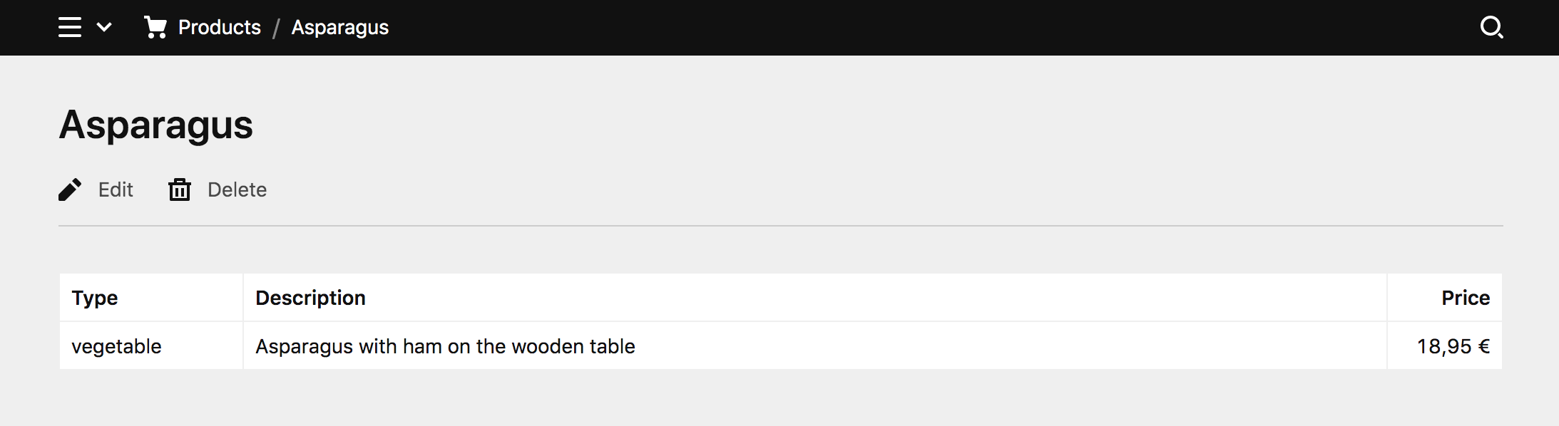
Depending on your real world data, you might want to choose a completely different layout for the single view, but that's up to you and you can start experimenting with your newly aquired knowledge from here on.
Refactoring time
It's time to clean up again. The price method is used by both views – products and product. We shouldn't declare it twice. This is easy to fix though.
We'll create a new price.js file in a new folder /site/plugins/products/src/helpers
export default (price) => {
  return new Intl.NumberFormat("de-DE", {
    style: "currency",
    currency: "EUR",
  }).format(price);
};
Now we can import that helper in the script part of both components:
<template>
  ...
</template>

<script>
import price from "../helpers/price.js";

export default {
  props: {
    product: Object,
  },
  methods: {
    price,
  },
};
</script><template>
...
</template>
<script>
import price from "../helpers/price.js";
export default {
props: {
products: Object,
},
methods: {
price,
},
};
</script>Much better!
Still here? How about some sortable columns?
Sortable columns
Our table in the products view could really use some sortable columns. This is an example where our new Fiber architecture really shines again and it's much easier to implement than you might think.
Let’s go back to our views/products.php first to implement the backend logic.
<?php

use Kirby\Products\Product;
use Kirby\Toolkit\A;

return [
    'pattern' => 'products',
    'action'  => function () {
        $sort = get('sort', 'title');
        $dir  = get('dir', 'asc');

        $products = Product::list();
        $products = A::sort($products, $sort, $dir);

        return [
            'component' => 'k-products-view',
            'props' => [
                'dir'      => $dir,
                'sort'     => $sort,
                'products' => $products
            ]
        ];
    }
];
That’s already it. The view is now able to receive two query parameters: sort and dir via the get() method. You can already give it a try by adding the query string to your browser's URL bar manually.
/panel/products?sort=price&dir=descThe second argument in the get() method is the default value that should be used if the key in the query string is empty or not set.
We use Kirby’s A::sort() to sort our products array by the column defined by $sort and the sorting direction defined by $dir
We also pass both variables as props. You’ll see in a minute why our view component needs to know about those.
Back to the frontend
The Products.vue component needs a few adjustments to make those table headers clickable and to update the query parameters accordingly.
Let's start by adding buttons to our <th> elements in the table.
<template>
    ...
      <table class="k-products">
        <tr>
          <th>
            <button @click="sortBy('title')">
              Title
            </button>
          </th>
          <th class="k-product-type">
            <button @click="sortBy('type')">
              Type
            </button>
          </th>
          <th>
            <button @click="sortBy('description')">
              Description
            </button>
          </th>
          <th class="k-product-price">
            <button @click="sortBy('price')">
              Price
            </button>
          </th>
          <th class="k-product-options"></th>
        </tr>
        <tr v-for="(product, id) in products" :key="id">
          ...
        </tr>
      </table>
    ...
</template>
On click, a new sortBy method is called and the column name is passed.
<script>
import price from "../helpers/price.js";

export default {
  props: {
    products: Object,
  },
  methods: {
    price,
    sortBy(sort) {
      this.$reload({
        query: {
          sort: sort
        },
      });
    },
  },
};
</script>
The sortBy method uses our built-in $reload method to reload the current view. You can use this in your plugin code to create a simple reload, which will update all the data of the current view, but you can also pass query parameters which then can be used on the backend to change data.
In this example, we pass the column name with the sort query parameter. Our get() method in the products.php will fetch the column name and the products accordingly. Give it a try.
So far the sorting direction is not changed yet. You will only get sorted results in ascending order.
Oh, I almost forgot: we need to adjust our styling a bit to make the buttons look nicer. Add the following to your style block:
.k-products th button {
  font: inherit;
  text-align: left;
  width: 100%;
}
Toggling the sorting direction
Whenever we click on a sorting button, it would be really nice if the sorting direction could change.
Here’s why we needed to send the sort and dir props from the backend. Let’s have another look at the sortBy method:
<script>
import price from "../helpers/price.js";

export default {
  props: {
    dir: String,
    sort: String,
    products: Object,
  },
  methods: {
    price,
    sortBy(sort) {
      // sort ascending by default
      let dir = "asc";

      // toggle direction when resorting the same column
      if (sort === this.sort) {
        dir = this.dir === "asc" ? "desc" : "asc";
      }

      // refresh the view with the updated query parameters
      this.$reload({
        query: {
          sort: sort,
          dir: dir,
        },
      });
    },
  },
};
</script>
By defining the new sort and dir props, we can work with them in our sortBy method. Those props will update whenever the view is loaded or reloaded.
The sortBy method will now compare which column is currently resorted. If you click on the same column header twice, the sort direction will now change.
To send the sort direction to the server, dir is added to the query object and our toggles should work.
One last thing
So far, the user cannot really see which column is sorted and in which direction. Let’s wrap it up with a nice little sorting arrow next to the column header.
Vue components can have computed properties, which are perfect to create our little arrow:
<script>
import price from "../helpers/price.js";

export default {
  props: {
    dir: String,
    sort: String,
    products: Object,
  },
  computed: {
    sortArrow() {
      return this.dir === "asc" ? "↓" : "↑";
    },
  },
  methods: {
    price,
    sortBy(sort) {
      ...
    },
  },
};
</script>
The computed property will be recalculated whenever the props of the component change (on load or reload in this case). This means that our little arrow will always update according to the sorting direction coming from the server.
Now we only need to add it to our template.
<template>
    ...
      <table class="k-products">
        <tr>
          <th>
            <button @click="sortBy('title')">
              Title
              <span v-if="sort === 'title'">{{ sortArrow }}</span>
            </button>
          </th>
          <th class="k-product-type">
            <button @click="sortBy('type')">
              Type
              <span v-if="sort === 'type'">{{ sortArrow }}</span>
            </button>
          </th>
          <th>
            <button @click="sortBy('description')">
              Description
              <span v-if="sort === 'description'">{{ sortArrow }}</span>
            </button>
          </th>
          <th class="k-product-price">
            <button @click="sortBy('price')">
              Price
              <span v-if="sort === 'price'">{{ sortArrow }}</span>
            </button>
          </th>
          <th class="k-product-options"></th>
        </tr>
        <tr v-for="(product, id) in products" :key="id">
          ...
        </tr>
      </table>
    ...
</template>
The wrapping span with the if clause makes sure that the arrow only shows up in the currently sorted column.
<span v-if="sort === 'type'">{{ sortArrow }}</span>If you add a class name to that span, you can also use it to apply some extra styling.
Here's our final table with the little sorting arrow: